Bitcoin Liquidation Map Explained: How to Read BTC Heatmap
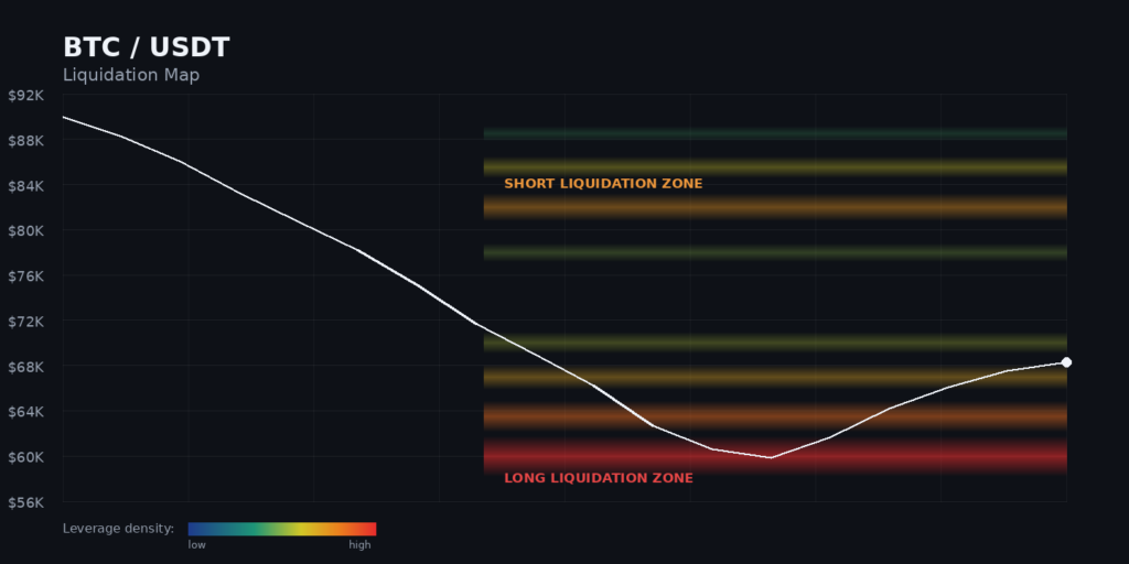
From January to February 6, 2026, Bitcoin dropped from roughly $90,000 to nearly $60,000.. A Bitcoin liquidation map had been flashing the warning for weeks: a thick band of long positions stacked between $60,000 and $70,000, waiting to be wiped out. When price slid into that zone, the positions detonated one after another, and the drop accelerated. Traders who could read the map saw it coming. Everyone else just saw red candles.
That is the whole point of a Bitcoin liquidation map. It shows you where the pain is buried before the market digs it up.
So picture two traders. Call them Riya and Arjun. Same chart, same coin, same Tuesday. Arjun watches price alone and gets blindsided by every violent wick. Riya watches the same price, but with a heatmap layered underneath it, and she can see the trapdoors before her feet find them. This post turns you into Riya.
Here is the short version, since you came for an answer: a Bitcoin liquidation map is a visual chart that plots the price levels where leveraged traders will be forced out of their positions. Bright zones mean crowded leverage. Price tends to get pulled toward those zones. Read them right, and you stop trading blind.
Let us build that skill from the ground up.
What Is a Bitcoin Liquidation Map?
Start with the thing that makes a liquidation possible: leverage.
When you trade Bitcoin futures with leverage, you borrow to control a position larger than your own cash. Put down $1,000 at 10x, and you control $10,000 of BTC. Sweet when price moves your way. Brutal when it does not, because the exchange sets a liquidation price, the level where your margin runs out. Hit it, and the exchange force-closes your trade automatically. No confirmation box. No second chance.
Now multiply that across thousands of traders. Millions of them. Each carries a personal liquidation price. Cluster all those prices together and you get a map of where forced selling and forced buying are likely to erupt.
A Bitcoin liquidation map is that cluster, drawn out. A liquidation heatmap visualizes price levels where large clusters of leveraged positions are likely to be forcibly closed. It transforms raw exchange data into a color-coded overlay on price charts, revealing exactly where the “hidden liquidity” sits, and where price is most likely to move next.
Think of it like a topographic map for a mountain range, except the peaks are piles of leverage instead of rock. The taller the peak, the more money is sitting there ready to blow.
Liquidation Map vs Liquidity Heatmap: Same Thing?
Quick clarification, because the two terms get mixed up constantly.
A Bitcoin liquidation map (sometimes shown as a “liquidation map” with distinct bars) estimates individual liquidation levels and often projects magnitude at specific prices. A liquidation heatmap shows the same underlying idea as a smooth color gradient over time. In everyday trading talk, people use “BTC liquidation map” and “Bitcoin liquidation heatmap” interchangeably, and that is fine. Both answer the same question: where is the crowded leverage?
A separate tool, the order-book liquidity heatmap, shows resting buy and sell orders instead of liquidation levels. Related cousin, different data. Do not confuse the two.
How a Bitcoin Liquidation Heatmap Is Calculated
You do not need to build one yourself, but you should know what is under the hood so you trust the colors.
The core principle of a liquidation heatmap relies on calculating liquidation risks across different price ranges using market trading volume, leverage usage, and other relevant market data. These calculations are then presented on a chart in the form of a color gradient.
In plain terms, the tool takes:
Open positions and volume across major exchanges
Assumed leverage tiers (traders using 10x, 25x, 50x, 100x)
Entry and mark price data to estimate each level’s liquidation price
Then it stacks every estimated liquidation price into bands and paints them by density.
One honest caveat you must internalize: these are estimates, not certainties. No exchange publishes the exact liquidation price of every trader. The map infers them. It is a strong probability model, not a leaked spreadsheet.
Most traders pull this data from Coinglass, which aggregates estimates from Binance, Bybit, OKX, and other big venues, and offers views from 12 hours out to a full year.
How to Read a Bitcoin Liquidation Map: Colors and Zones
Here is where Riya earns her edge. The colors are the language.
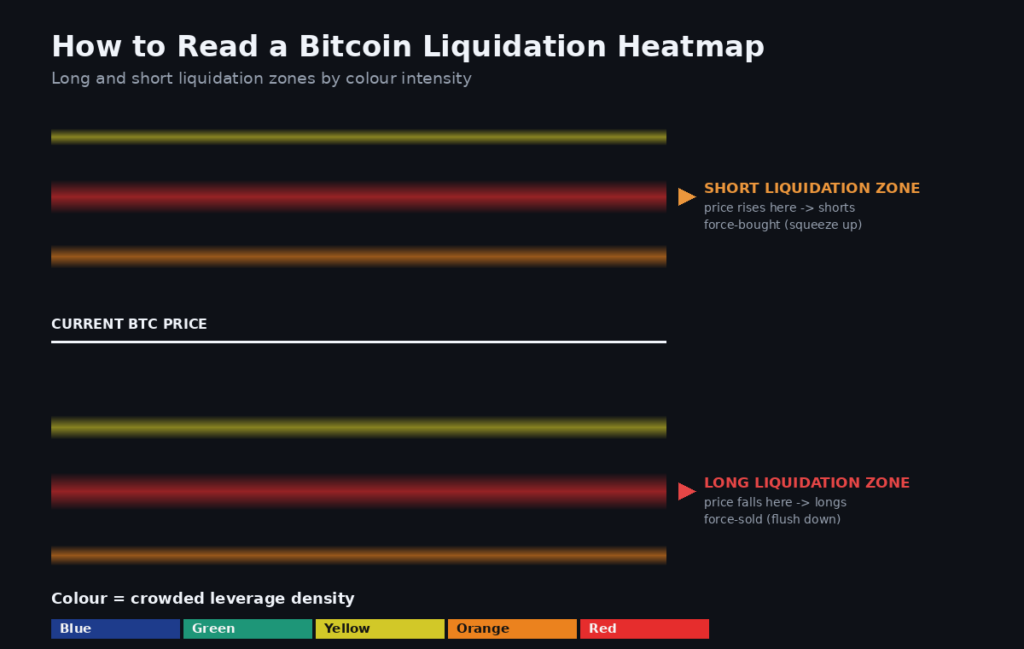
Blue zones usually represent weaker pockets of projected liquidations, while yellow and red zones point to denser areas where crowded leverage may unwind faster. BitcoinCounterFlow
Now read direction:
Long liquidation zones sit below current price. If Bitcoin falls into them, longs get force-sold, which pushes price down harder. Forced selling feeds the drop.
Short liquidation zones sit above current price. If Bitcoin rises into them, shorts get force-bought (a short squeeze), which pushes price up harder. Forced buying feeds the rally.
So a bright band below you is a magnet dragging price toward a flush lower. A bright band above you is a magnet dragging price toward a squeeze higher. Simple once you see it.
Why Price Moves Toward Liquidation Clusters
This part feels almost conspiratorial the first time you notice it. Price seems to hunt the clusters.
There is no cartoon villain steering the market. The mechanics do it on their own. Dense liquidation clusters act as price magnets, pulling BTC toward them before reversing. When a cluster gets hit, forced orders slam into the book. Those forced orders push price further in the same direction, which trips the next cluster, which forces more orders. A chain reaction.
Large players also know exactly where retail leverage sits, because they read the same map you now can. Nudging price into a fat cluster to trigger a wave of forced liquidity is a real and well-documented behavior. This is what traders mean by a liquidity sweep.
Liquidation Cascade: When One Domino Topples the Rest
A liquidation cascade is the map’s nightmare scenario made real, and it is worth studying because it is where fortunes evaporate in minutes.
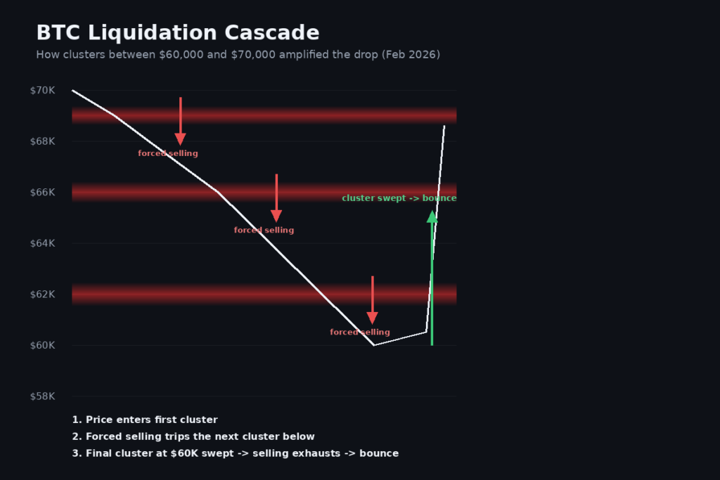
Back to February 2026. The correction that began in late January 2026 saw Bitcoin fall from approximately $90,000 to $60,000 by February 6. According to VanEck’s research, this sell-off produced $3-4 billion in total liquidations over one week, with $2-2.5 billion concentrated in Bitcoin futures alone.
Here is the mechanical story the map told in advance. The liquidation heatmap had displayed dense long-liquidation clusters between $60,000 and $70,000 for weeks before the crash materialized. As price descended through each cluster, the cascade effect amplified the decline. Every level that broke forced more selling, which broke the next level.
And notice how it ended. The $60,000 level served as the final major cluster, and when it was swept, selling pressure exhausted, BTC bounced and rallied back toward $68,600. Once the fuel was gone, the fire went out. The biggest cluster was both the target and the turning point. That pattern repeats.
A Simple Bitcoin Liquidation Map Trading Strategy
You will not trade a liquidation map in isolation, and anyone who tells you to is selling something. But here is a clean, repeatable framework Riya actually uses.
Find the biggest clusters. Identify the brightest zones above and below price. Those are your magnets.
Note the direction bias. Heavier below means downside pull risk. Heavier above means squeeze-up potential.
Watch price approach, do not front-run. Wait for BTC to actually reach the zone. Anticipation gets you chopped up.
Confirm with open interest and funding. To gauge whether a zone is likely to reverse or continue price, watch Open Interest and Funding Rate as price approaches. A rising OI into the zone signals that new leveraged positions are being opened in the prevailing direction, increasing the chance of a trap. BitcoinCounterFlowBitcoinCounterFlow
Plan the reaction, both ways. A swept cluster can reverse sharply or accelerate the trend. Have an if-this-then-that plan for each.
There is also a defensive use most beginners skip. Before entering a leveraged trade, checking the heatmap shows whether your liquidation price sits near a cluster of others, which increases the probability of a cascade sweeping your position. If your liquidation price sits inside a bright red band, you are volunteering to be the fuel. Size down or move your entry.
Indicators to Pair With Your Bitcoin Liquidation Map
The map tells you where. These tell you whether and how hard.
Open interest: rising into a cluster means fresh leverage stacking, higher cascade odds.
Funding rate: extreme positive funding means longs are crowded and vulnerable; extreme negative means shorts are exposed.
Long-short ratio: confirms which side is overcrowded.
CVD (cumulative volume delta): shows whether real buying or selling is driving the approach.
Order-book depth: reveals whether there is a wall to absorb the forced flow.
Use the map as your center of gravity, and let these orbit it. One indicator alone is a guess. A stack of agreeing signals is an edge.
The Honest Limitations
Riya wins not because the map is magic, but because she respects what it cannot do.
Liquidation levels are estimated, not exact. Treat bright zones as regions, not precise price tags.
A heatmap cannot predict Bitcoin’s price. It shows where fuel sits, not which day someone lights it.
Clusters rebuild constantly. After a sweep, traders pile back in and new zones form within hours, exactly what happened after the February 2026 bounce when longs reloaded.
Leverage itself is the real risk. According to CoinGlass data, over $3-4 billion in crypto positions were liquidated in a single week during February 2026. The map does not make leverage safe. It just makes you less blind while using it.
The Bottom Line
A Bitcoin liquidation map turns the market’s hidden leverage into something you can actually see. Bright zones are crowded positions. Price gets pulled toward them. Longs flush the market down, shorts squeeze it up, and the biggest cluster is often where the move exhausts and reverses.
You do not need to predict the future. You just need to stop walking into trapdoors you could have seen. Read the colors, respect the direction, confirm with open interest and funding, and never let your own liquidation price become someone else’s fuel.
Riya and Arjun started the day with the same chart. Only one of them could see the map. Now you can too.
Ready to put it to work? Open a Bitcoin liquidation map on Coinglass, layer it against live price, and paper-trade one cluster before you risk a rupee. When you are ready to trade BTC futures with proper risk controls, start on Mudrex.
Disclaimer: This article is for educational purposes only and is not financial advice. Leverage trading carries a high risk of loss. Cryptocurrency markets are volatile. Always do your own research and never trade more than you can afford to lose.
FAQs
What is a Bitcoin liquidation map?
A Bitcoin liquidation map is a visual chart that plots the price levels where leveraged futures traders will be force-closed. Dense clusters show where large amounts of leverage sit, and price often gets pulled toward those zones.
How is a liquidation heatmap calculated?
It is calculated from market trading volume, assumed leverage levels, and open position data across major exchanges, then displayed as a color gradient. The levels are estimates inferred from market data, not exact figures published by exchanges.
Are Bitcoin liquidation levels exact?
No. Exchanges do not publish every trader’s liquidation price, so the map estimates them from leverage and volume data. Treat bright zones as probable regions rather than precise price tags.
Can a liquidation map predict Bitcoin’s price?
Not directly. It shows where forced buying or selling is likely to concentrate, which helps anticipate where price may be pulled or reverse. It does not tell you when a move will happen or guarantee any outcome.
What is a liquidation cascade?
A liquidation cascade is a chain reaction where one cluster of forced liquidations pushes price into the next cluster, triggering more forced orders. The February 2026 drop from about $90,000 to $60,000 was a real example, producing $3 to $4 billion in liquidations in one week.
Which indicators should I use with a liquidation map?
Pair it with open interest, funding rate, long-short ratio, CVD, and order-book depth. The map shows where the fuel is; these confirm whether a cluster is likely to reverse price or accelerate the trend.
Anupam has over 3 years of experience in the crypto industry, having worked with top indian crypto exchanges. He writes about Bitcoin, altcoins, AI, and emerging tech, helping readers understand what’s driving markets and where the digital asset ecosystem is headed.