A Reddit user posting morale-boosting charts during a brutal 2014 bear market probably didn’t expect his joke to still be checked by millions of people twelve years later, but that’s exactly what happened to the Bitcoin Rainbow Chart.
What started as a hand-tweaked meme is now a widely tracked, continuously updated valuation tool that plots BTC’s price on a logarithmic scale against color-coded bands ranging from “Basically a Fire Sale” to “Maximum Bubble Territory.” It has never been a scientific price predictor, and its own creator says so explicitly. Here’s what it actually shows, how to read every band, and where the model’s real limits are.
TL;DR
The Bitcoin Rainbow Chart plots BTC price on a logarithmic scale, overlaid with 9 color bands built around a regression curve fitted to Bitcoin’s full price history.
Blue bands mean historically undervalued, red bands mean historically overvalued, relative to the model’s long-term trend line, not any fundamental analysis.
The chart has gone through real revisions: a 2019 V1, a 2022 V2 with a refit formula, and now a Dynamic Rainbow Chart that recalculates its curve in real time.
As of mid-2026, BTC sits in the lowest bands of the chart, well below its October 2025 all-time high.
Its own creator explicitly states it is not investment advice and has no scientific basis, a disclaimer worth taking seriously.
What Is the Bitcoin Rainbow Chart?
The Bitcoin Rainbow Chart is a long-term valuation tool that plots Bitcoin’s price on a logarithmic scale and overlays it with color-coded bands, built around a regression curve, to visually flag whether the price looks historically cheap or expensive.
It uses a logarithmic scale to smooth out Bitcoin’s short-term volatility and highlight the long-term trend.
The 9 color bands range from deep blue (historically undervalued) to dark red (historically overvalued).
It was never intended as ascientific prediction model, a point its creator has repeated for years.
It remains one of the most viewed Bitcoin charts online, with tens of millions of views on its original hosting site alone.
Who Created the Bitcoin Rainbow Chart?
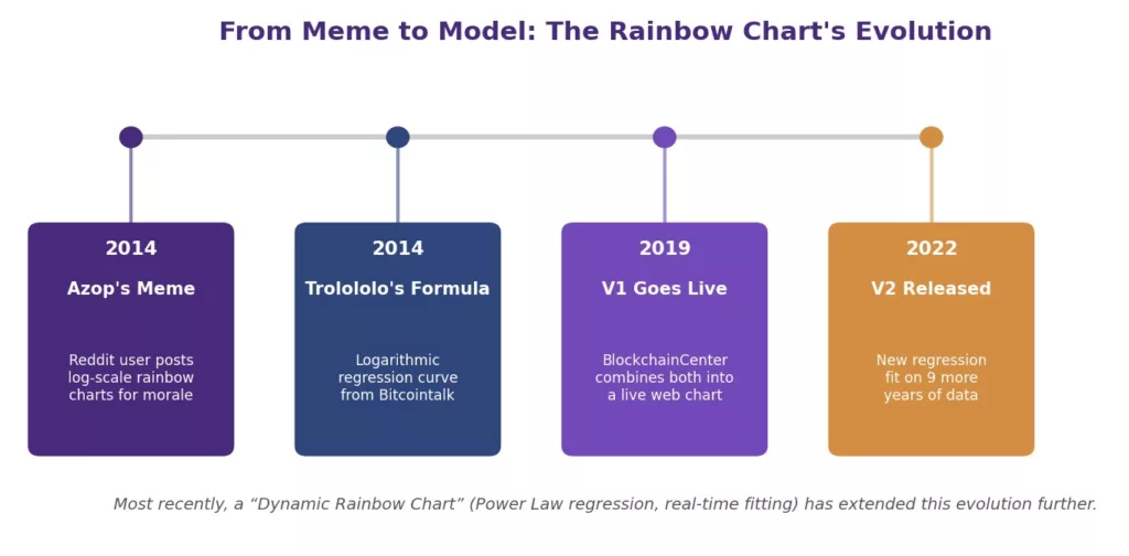
The Bitcoin Rainbow Chart traces back to a Reddit user named “azop,” who began posting log-scale rainbow-colored charts on r/Bitcoin in 2014 during a deep bear market, originally just to boost community morale rather than to predict prices, according to BlockchainCenter’s own account of the chart’s history.
Bitcoin Rainbow Chart: What It Is & How to Read It
Separately, a Bitcointalk forum user known as “trolololo” had developed a logarithmic regression formula for Bitcoin’s price around the same period. In 2019, during another brutal bear market, a developer who now goes by Rohmeo combined azop’s rainbow color concept with trolololo’s regression formula to build the first always-updating, live version of the chart, hosted on BlockchainCenter.net. That 2019 version is now referred to as V1.
Definition: Logarithmic Regression A statistical curve-fitting method that models a relationship where the rate of growth slows over time; on a logarithmic price scale, this produces a smoother, flattening trend line rather than a straight one.
The chart briefly became a flashpoint in 2020 when it was used to publicly mock the “Stock-to-Flow” model, a rival Bitcoin valuation framework that claimed scientific rigor but was later widely discredited after failing to predict Bitcoin’s price action. The joke was that a chart explicitly built as a meme performed just as well.
How Is the Bitcoin Rainbow Chart Calculated?
The Bitcoin Rainbow Chart is calculated by fitting a regression curve to Bitcoin’s entire historical price series on a logarithmic scale, then drawing parallel color bands above and below that curve at fixed distances to represent different valuation zones.
The original V1 formula, inherited from trolololo’s 2014 work, was a logarithmic regression: y = 2.9065ln(x) − 19.493, where x represents days since Bitcoin’s genesis block. This produced a curve that, on a logarithmic price axis, appears to flatten gradually over time rather than continuing in a straight line.
Definition: R-Squared (R²) A statistical measure of how well a regression curve fits historical data, expressed as a percentage; higher values mean the curve more closely tracks the actual historical price series.
The newest iteration, called the Dynamic Rainbow Chart, replaces the static formula entirely. Instead of a fixed equation from a single point in time, it fits a Power Law regression across Bitcoin’s full daily price history since 2012 in real time, achieving a reported 94.3% R² fit strength and adjusting automatically as new price data arrives, rather than requiring a manual refit every few years.
What Do the Bitcoin Rainbow Chart Colors Mean?
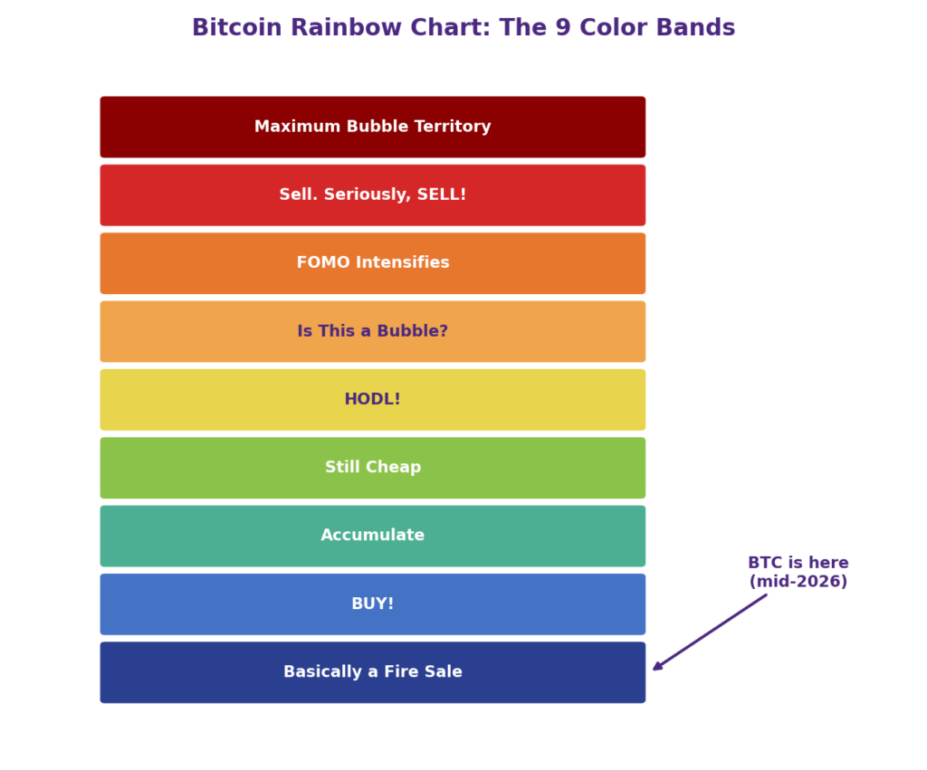
Each of the Bitcoin Rainbow Chart’s 9 color bands represents a different distance from the model’s central regression curve, with cooler colors indicating historically undervalued prices and warmer colors indicating historically overvalued prices.
Bitcoin Rainbow Chart: What It Is & How to Read It
Band (top to bottom)
Color
General Meaning
Maximum Bubble Territory
Dark red
Extreme historical overvaluation, euphoric top
Sell. Seriously, SELL!
Red
Significant overvaluation
FOMO Intensifies
Dark orange
Buyer enthusiasm dominating, late-cycle heat
Is This a Bubble?
Light orange
Balanced-to-warm zone, no clear signal
HODL!
Yellow
Near the model’s central trend line
Still Cheap
Green
Below trend, historically a decent entry zone
Accumulate
Light blue-green
Undervalued, quieter market conditions
BUY!
Blue
Deep undervaluation
Basically a Fire Sale
Dark blue
Extreme historical undervaluation, capitulation zone
The blue band meaning and red band meaning are the two most-cited reference points: blue bands have historically marked periods after sharp corrections when sentiment was poor but prices later recovered, while red bands have historically marked euphoric tops that preceded major drawdowns. Neither is a guarantee of what happens next.
Which Rainbow Band Is Bitcoin In Now?
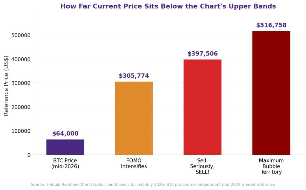
As of mid-2026, Bitcoin sits in the lowest bands of the Rainbow Chart, generally described as “Basically a Fire Sale” or “BUY!” territory, following a roughly 50% decline from its October 2025 all-time high of around $124,700.
Multiple trackers placed BTC in the “Basically a Fire Sale” band through much of the first half of 2026, with reference prices in the low-to-mid $60,000s sitting well below the model’s higher bands. To put the gap in scale, one snapshot from July 2026 placed the chart’s top “Maximum Bubble Territory” band above $500,000, several multiples above BTC’s actual trading price at the time.
Bitcoin Rainbow Chart: What It Is & How to Read It
It’s worth remembering that the Rainbow Chart’s bands are extremely wide by design. Sitting in “Basically a Fire Sale” doesn’t mean a bounce is imminent, and Bitcoin has stayed in low bands for extended stretches before, sometimes for many months, before ever mounting a recovery.
What’s the Difference Between Rainbow Chart V1 and V2?
Rainbow Chart V1, launched in 2019, used the original 2014 logarithmic regression formula largely unchanged, while V2, released in November 2022, used a completely refit regression built on nine additional years of price data to correct for how optimistic the original formula had become.
By 2022, V1’s red band already implied Bitcoin should be worth over $300,000, and even the model’s yellow “HODL!” band sat above $100,000, levels that looked increasingly disconnected from where Bitcoin was actually trading. The chart’s creator acknowledged the original 2014 formula had been “too optimistic” and published V2 to correct it, while deliberately keeping the same classic color scheme and band structure.
Since V2, the chart has evolved further still. The newer Dynamic Rainbow Chart, built on a continuously refitting Power Law regression rather than a static formula, represents a third distinct era: instead of periodic manual updates every few years, the model now adjusts automatically as new price data comes in.
Is the Bitcoin Rainbow Chart Accurate?
The Bitcoin Rainbow Chart has held up reasonably well as a rough historical guide, but it has never been validated as a scientific price model, and even its own creator disclaims any predictive power.
Its accuracy limitations are real and worth naming directly:
It has no fundamental basis. The bands are drawn from curve-fitting alone, with no input from adoption metrics, regulation, macro conditions, or ETF flows.
It has required manual revisions. The jump from V1 to V2 in 2022 happened specifically because the original formula’s projections had become unrealistic, proving the “fixed” model wasn’t actually fixed.
It briefly broke its own bands. In late 2022, Bitcoin’s price fell below every color band on the chart for the first time in nearly eight years, forcing the addition of a new indigo/violet band that itself didn’t hold for long.
It can’t anticipate shocks. Events like the 2020 COVID crash or exchange collapses aren’t and can’t be built into a model based purely on historical price curve-fitting.
None of this makes the chart useless, but it does mean the colorful “BUY!” and “SELL!” labels should be read as historical pattern descriptions, not trading signals.
Should You Use the Rainbow Chart Alone for Investment Decisions?
No. The Rainbow Chart works best as one input among several, not a standalone signal, and its own creator has stated outright that it carries no scientific basis and is not investment advice.
For a fuller picture of where Bitcoin sits in its cycle, analysts typically pair the Rainbow Chart with on-chain metrics like MVRV Z-Score and realized price, technical levels like the 200-week moving average, and broader market-cycle context. Our guide to on-chain analysis in crypto covers several of these complementary tools, and our breakdown of the Bitcoin halving cycle explains another major driver of Bitcoin’s long-term price pattern that the Rainbow Chart doesn’t explicitly model.
Conclusion
The Bitcoin Rainbow Chart started as a Reddit meme meant to boost morale during a brutal 2014 bear market, and it has since evolved through a real formula, two major revisions, and now a continuously self-updating model, while never losing its original, playful color-band labels. It’s a genuinely useful way to see where Bitcoin sits relative to its own long-term price history, but the colorful “BUY!” and “SELL!” bands were never meant to be taken literally, a point its own creator makes explicitly. Used alongside other indicators rather than in isolation, it remains one of the more enduring ways to visualize Bitcoin’s long-term cycles.
It’s a long-term valuation tool that plots Bitcoin’s price on a logarithmic scale against 9 color-coded bands built around a regression curve, showing whether the price looks historically cheap or expensive.
How do you read its color bands?
Cooler colors (blue, green) near the bottom indicate historical undervaluation, while warmer colors (orange, red) near the top indicate historical overvaluation, relative to the model’s central trend line.
What does the blue band mean?
Blue bands, especially “Basically a Fire Sale” and “BUY!,” have historically marked periods of deep undervaluation following sharp corrections, often near past cycle bottoms.
What does the red band mean?
Red bands, especially “Sell. Seriously, SELL!” and “Maximum Bubble Territory,” have historically marked euphoric, overextended prices that preceded major corrections.
Is the Bitcoin Rainbow Chart accurate?
It has held up as a rough historical guide but has no scientific or fundamental basis, has required real revisions (V1 to V2), and briefly broke its own bands in late 2022.
What is the difference between V1 and V2 of the Bitcoin Rainbow Chart?
V1 (2019) used the original 2014 formula largely unchanged; V2 (2022) used a completely refit regression on nine additional years of data after V1’s projections became unrealistically high.
Risk Disclaimer
Cryptocurrency investments carry a high risk of loss and are highly volatile. Any use of leverage or futures magnifies both potential gains and potential losses. The Bitcoin Rainbow Chart and the figures discussed in this article are illustrative, historical, and for educational purposes only; they are not financial advice and carry no scientific basis, a point its own creator has stated explicitly. Please consult a qualified financial advisor before making any investment decisions.
Siri is a writer venturing into the exciting realms of blockchain technology, cryptocurrency, and decentralized finance (DeFi), eager to explore the transformative potential of these innovations. She brings a unique perspective that bridges traditional industries and cutting-edge technology, often infused with a touch of humor through memes. She has a rich background in real estate and interior design, having previously contributed to NoBroker, where she crafted blogs and assets on these topics.